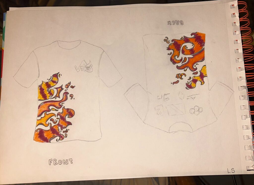
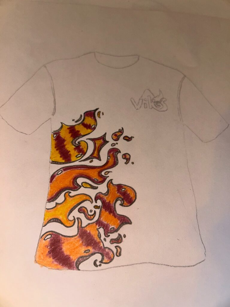
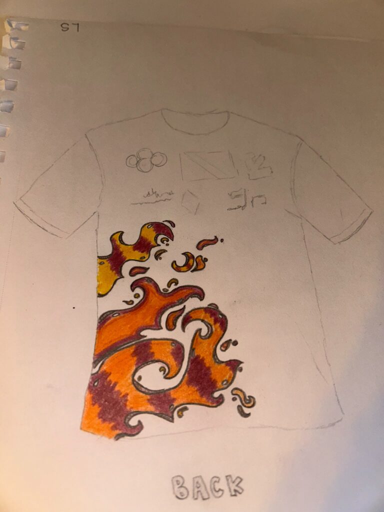
Aggressive Badminton Team T-Shirt Design
Aggressive Badminton Team T-Shirt Design
Concept Development:
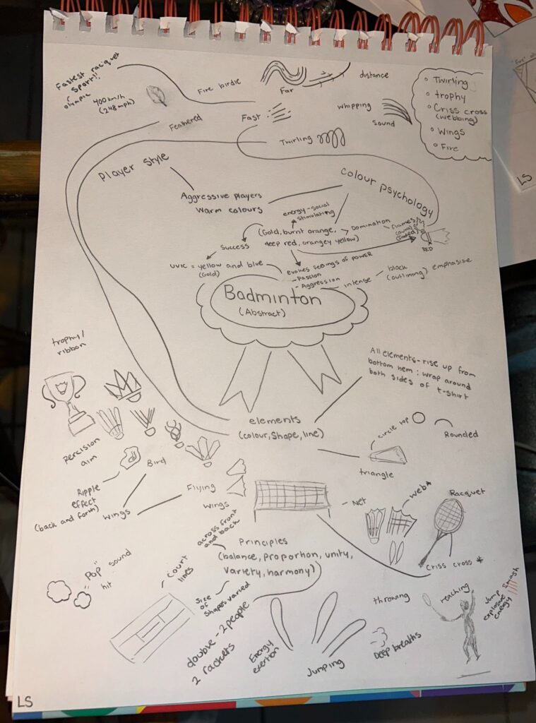
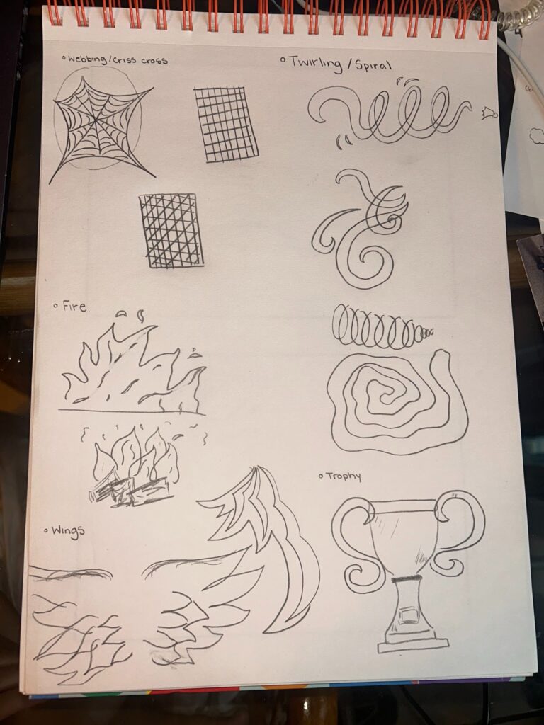
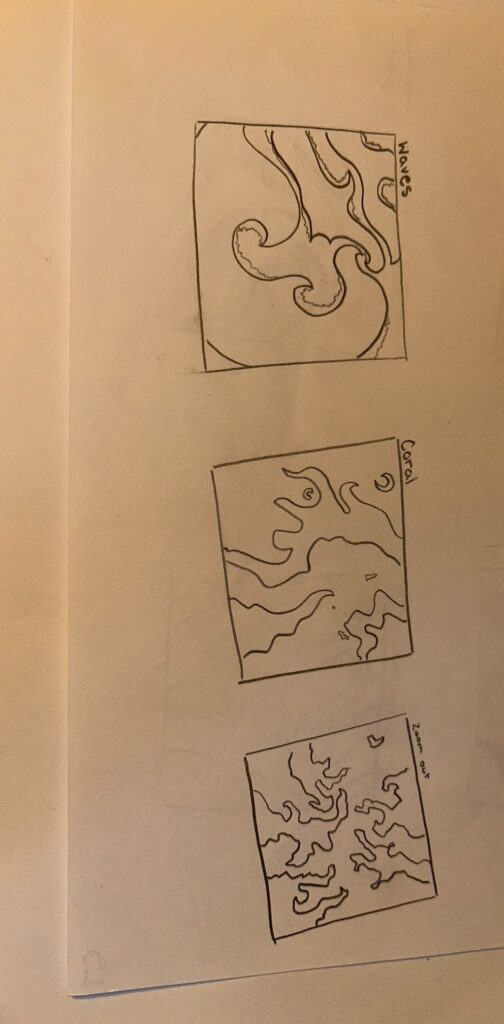
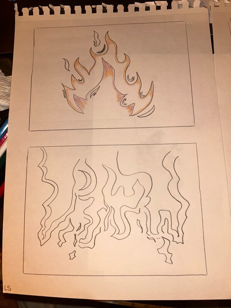
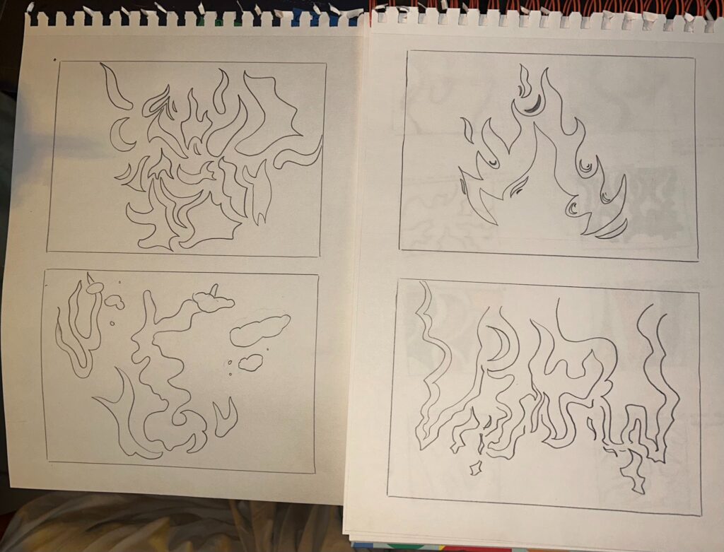
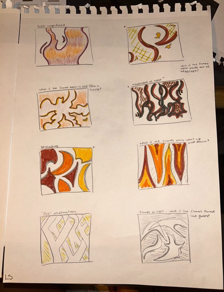
I initially approached this project with a very open mind. I wanted to develop a design exploring shape and different sizing to see what I could morph together and expand on in a fun way steering away from the more literal parts of badminton. I found that my word and rough sketch explorations were very helpful in this as I could better visualize a number of shapes that stood out to me and build off of these using “what if prompts” and the 30 Visual Research Methods Guide for Studio Work as catalysts, along with angle variety. Once I decided that the idea and image relating to fire would be the strongest representation for this team because of imagining a shuttleshock flying so fast its on fire, the term fire rally used to describe a super fast and intense rally, and due to coming to find out badminton is the fastest racket sport from the official olympic site, I got into exploring the shapes within flames. I got inspired by memories, the feelings you get while playing badminton and hitting the shuttlecock mid air with all your force especially within my colour and shading exploration. I delved into aggressive colour psychology with energy words standing out like burnt orange being stimulating, yellow as domination and dark red for power, passion and that main link to fires definition of fuel. After spending some time away from my drafts I went on a walk to make as many abstract visual connections to flames as I could. I went to the beach and stared at the raging waves having an “AHA” moment and relating the heatwaves going on around the world. Exactly what my design needed, engulfing, 3D arches and twirling lines of unique proportions to portray trailing flames, the way the shuttlecock flies through the air and the intense, high energy physics and psychology of the sport itself. This design is meant to make the team look intimidating, fierce and unstoppable.
It was difficult to officially decide on one direction for the design after branching off to so many ideas but taking breaks and coming back to patterns proved effective in shaping what I really wanted represented in the design and what the finalization of one focus can turn into especially in considering a range of input from others to collide, confirm or emphasize specific ideas like scaling/proportion or repetition in placement.
Initial Brainstorm, Notes, Research and Word List:
Rough Scetches:
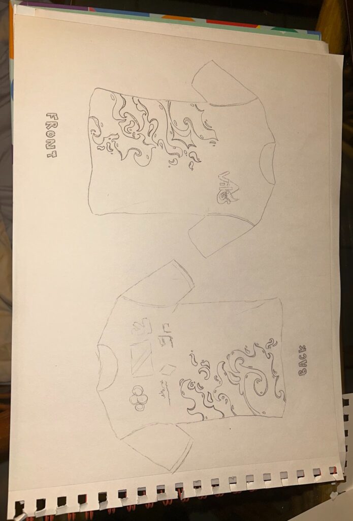
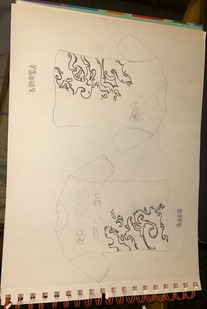
Refining Sketches:
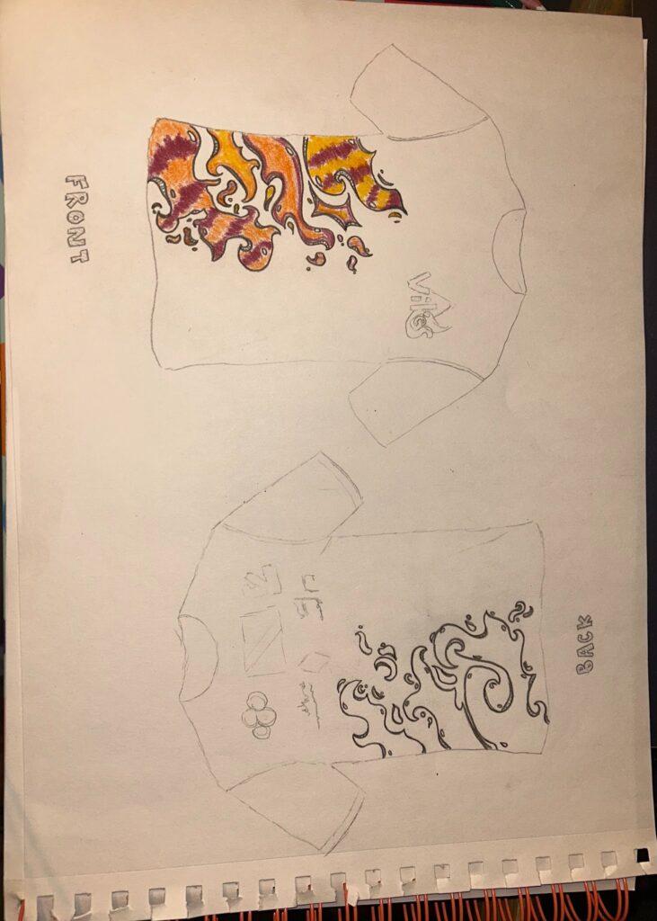
Final Visual Design Mock up: